LG Brand System
Strengthened the LG brand system by supporting governance, consistency, and scalability across multiple sub-brands and business divisions
Client
Internal governance work
Role
Primary Designer for the Division
Period
2016 - 2019
Overview
As the primary designer supporting a business division, I collaborated with an external branding agency to refresh the LG brand system. After its launch, I worked closely with designers across business divisions to scale the system through governance, brand standards, and shared visual guidelines, enabling consistent brand expression across LG's growing portfolio
What I did
Division-wide brand governance and guideline updates
Challenge
As LG's portfolio of sub-brands continued to expand, maintaining consistency, scalability, and a unified brand identity became increasingly complex. Each sub-brand required its own distinct character while remaining aligned with the overarching LG brand system
Create and sustain a scalable brand system that ensured consistency across LG's expanding portfolio while allowing each sub-brand to express its unique identity
Strengthened the scalability of the LG brand ecosystem by evolving shared brand standards, improving cross-division consistency, and supporting the seamless integration of new sub-brands


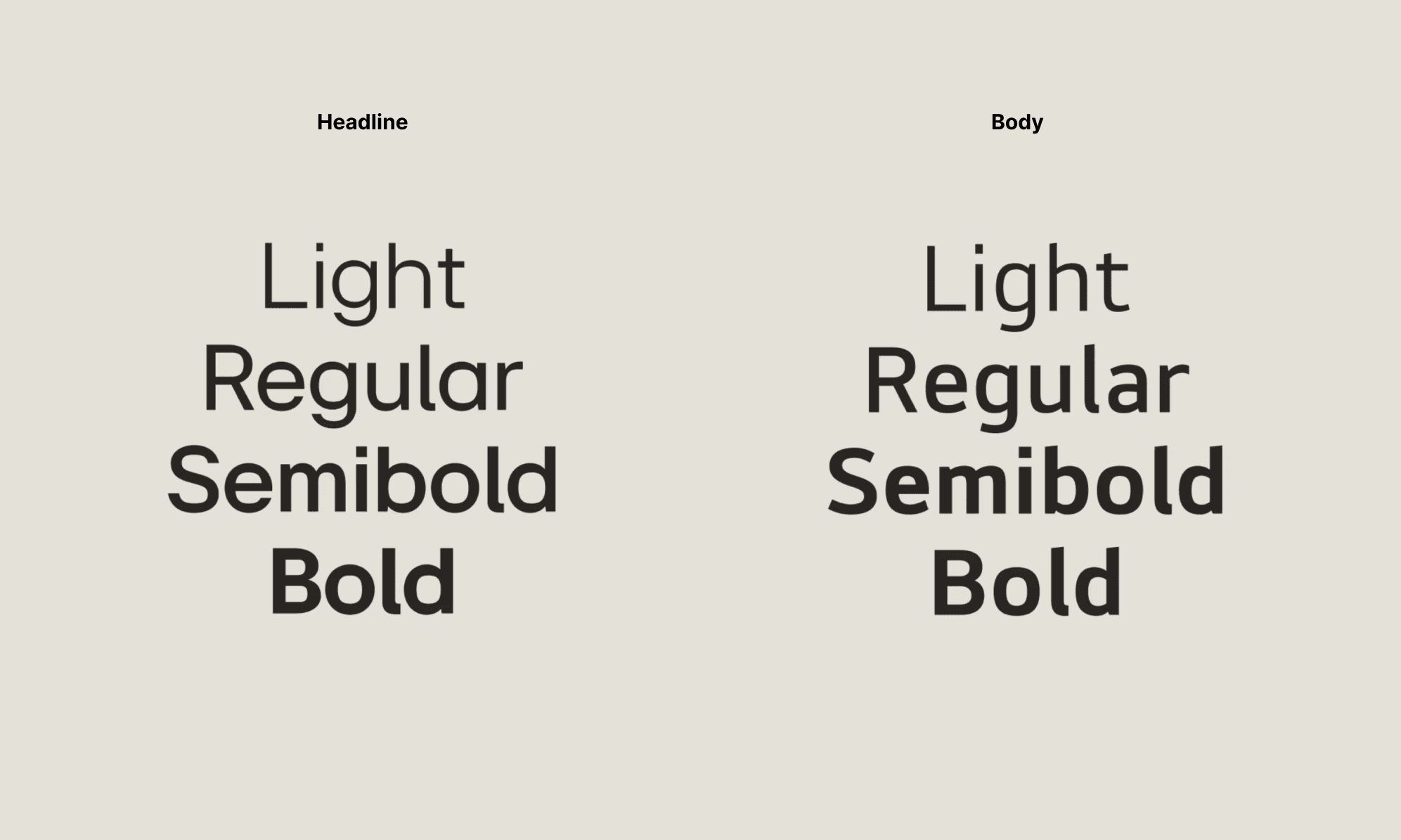
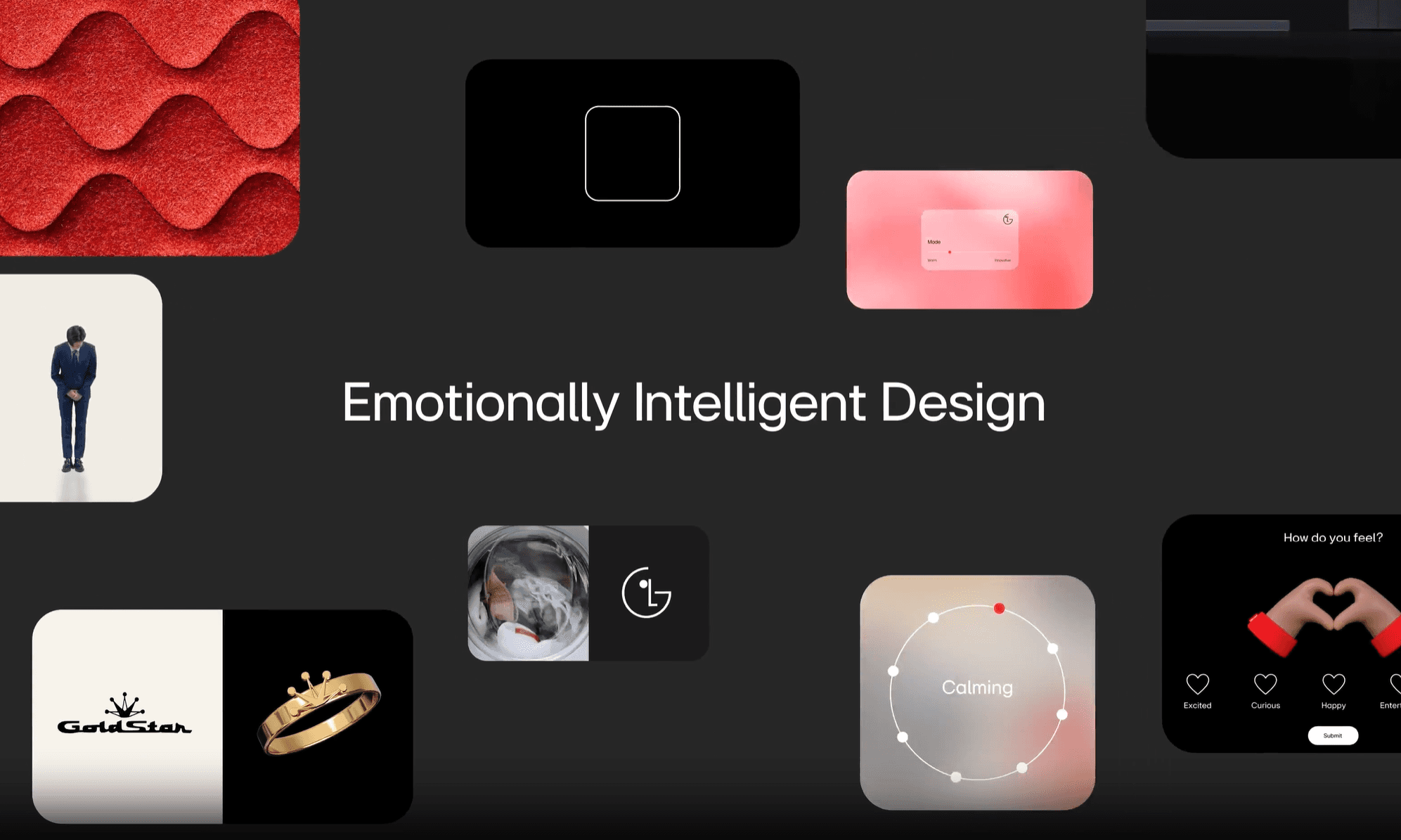
The LG EI font is a dedicated typeface that communicates our design philosophy of ‘Emotionally Intelligent Design’. The overall form of the font is geometric, and the external circle represents the innovative technology we create. The rounded edges inside the font and the strokes inspired by handwriting symbolize the elements of warmth and emotion we aspire to embody.

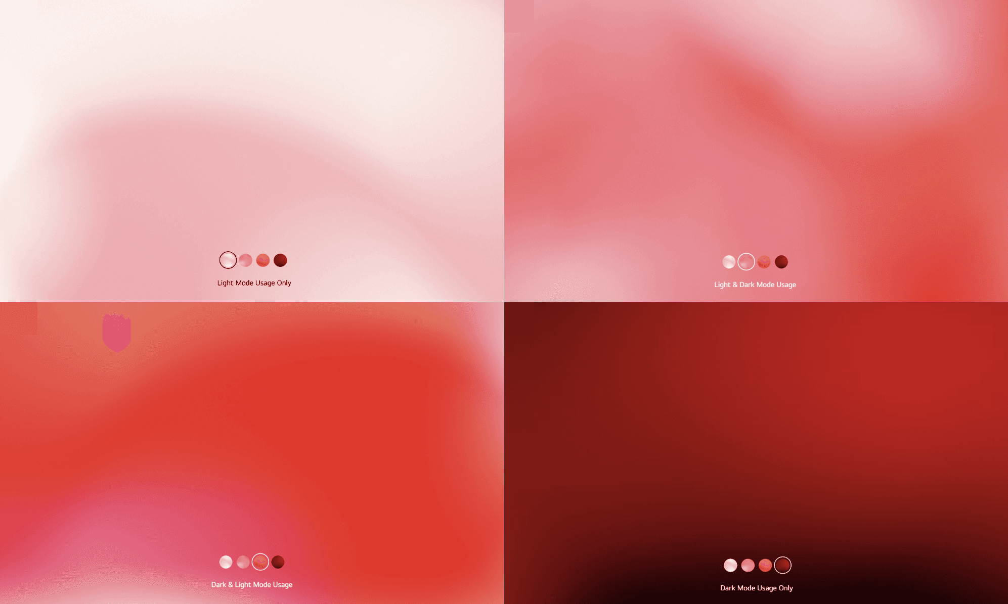
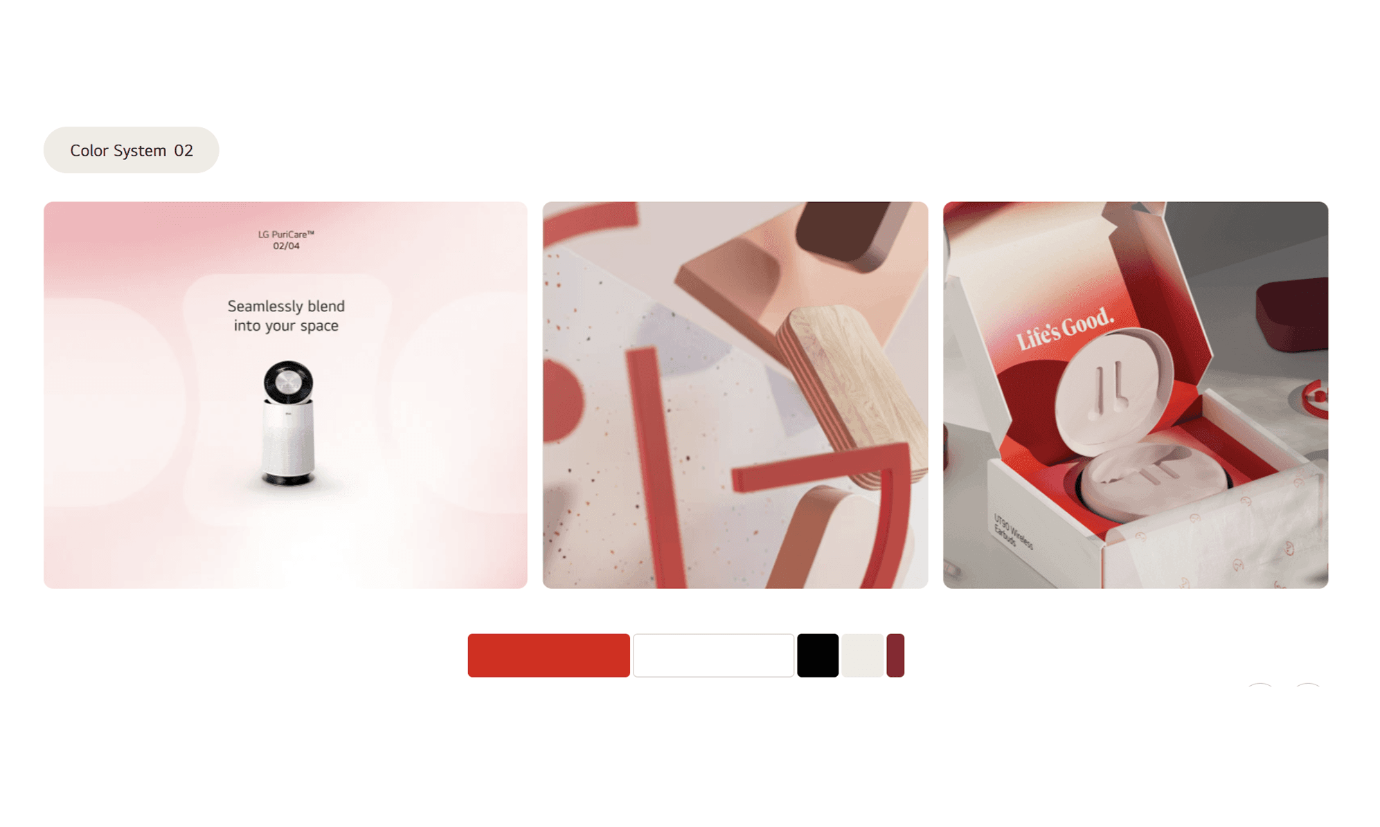
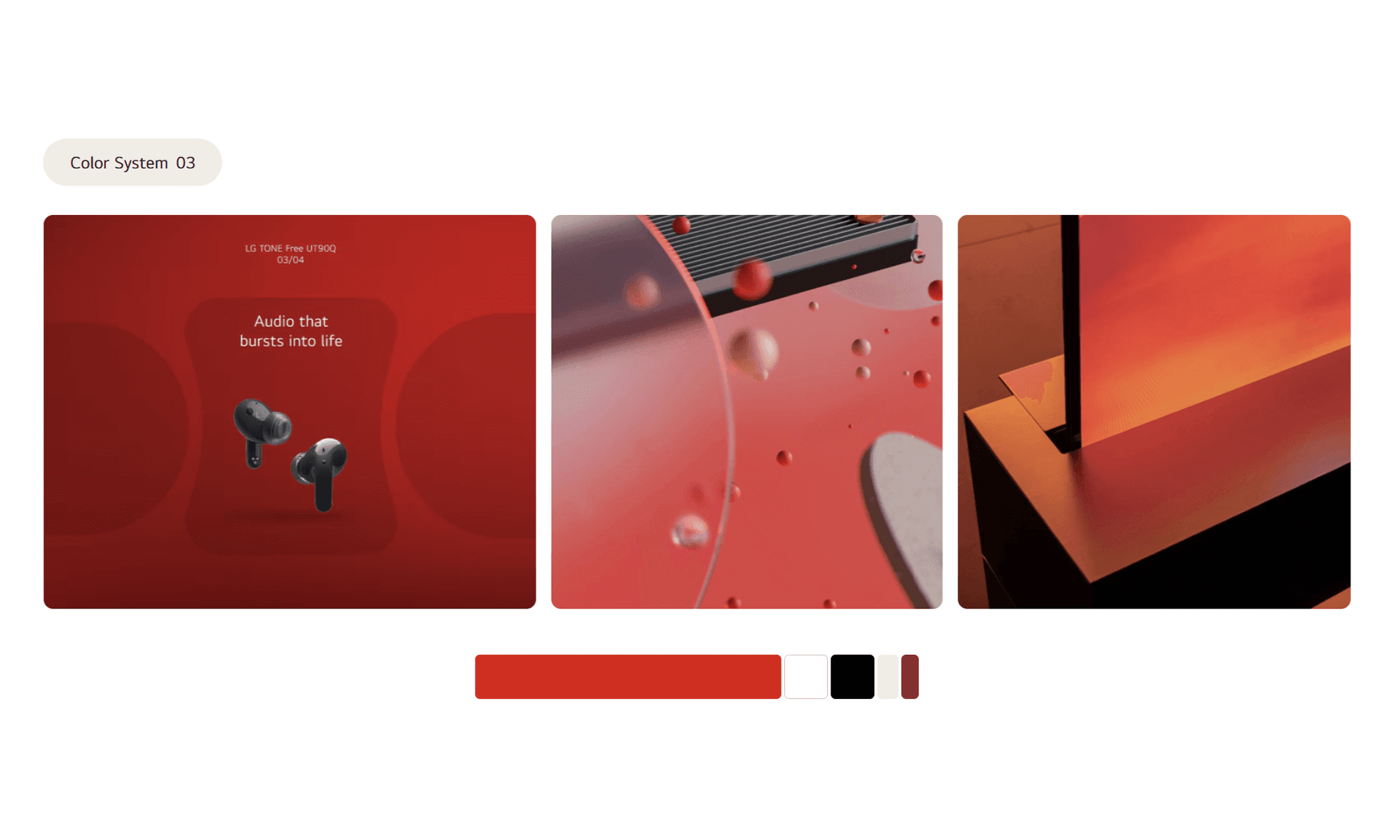
At our core, LG has always been a red brand. That is still true today. However, we’ve built outwards from our core to give our identity flex. Incorporating ‘Active Red’ and neutral colors so we can create excitement and restore balance when we need to.


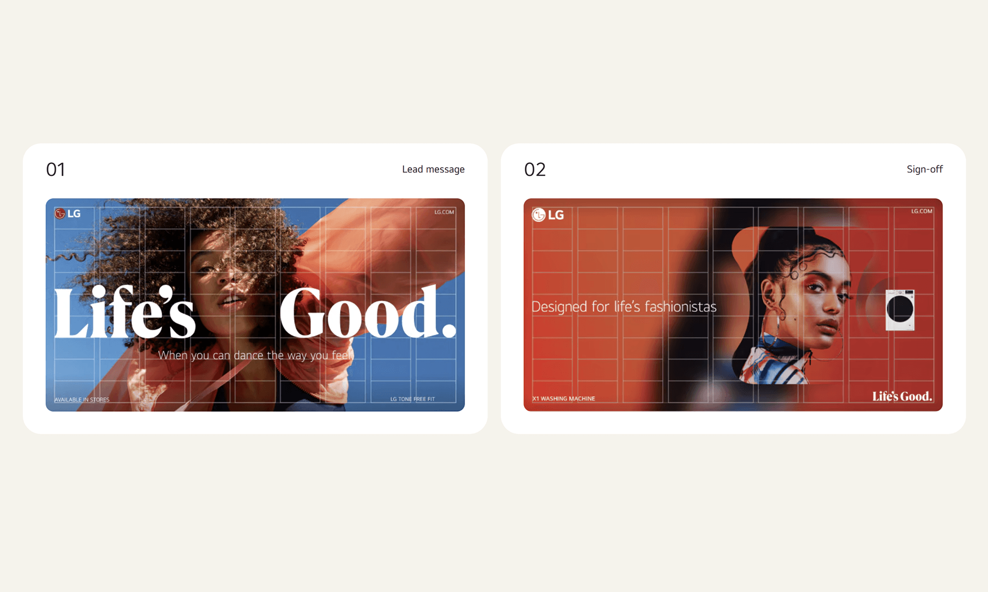
The LG EI font is a dedicated typeface that communicates our design philosophy of ‘Emotionally Intelligent Design’. The overall form of the font is geometric, and the external circle represents the innovative technology we create. The rounded edges inside the font and the strokes inspired by handwriting symbolize the elements of warmth and emotion we aspire to embody.
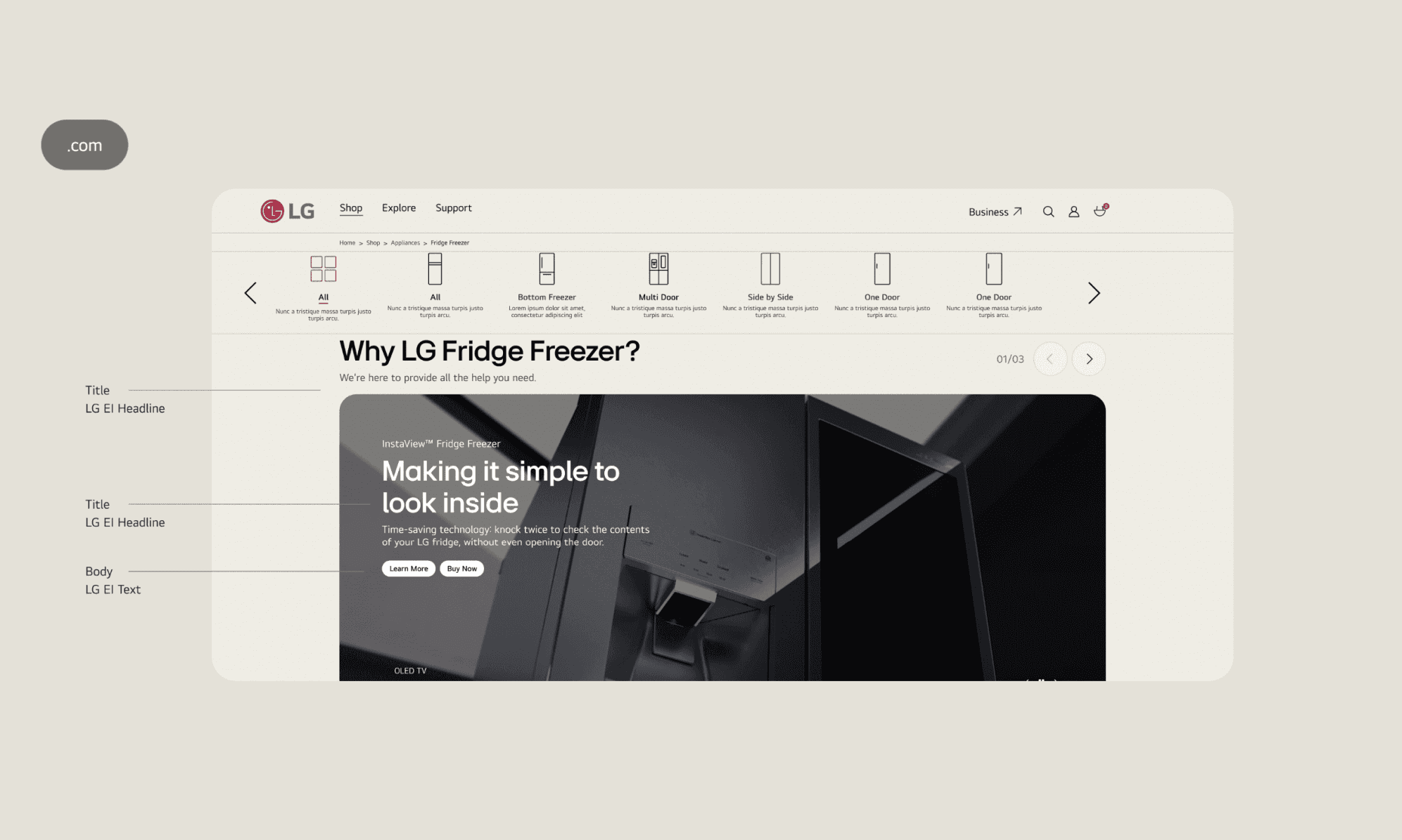
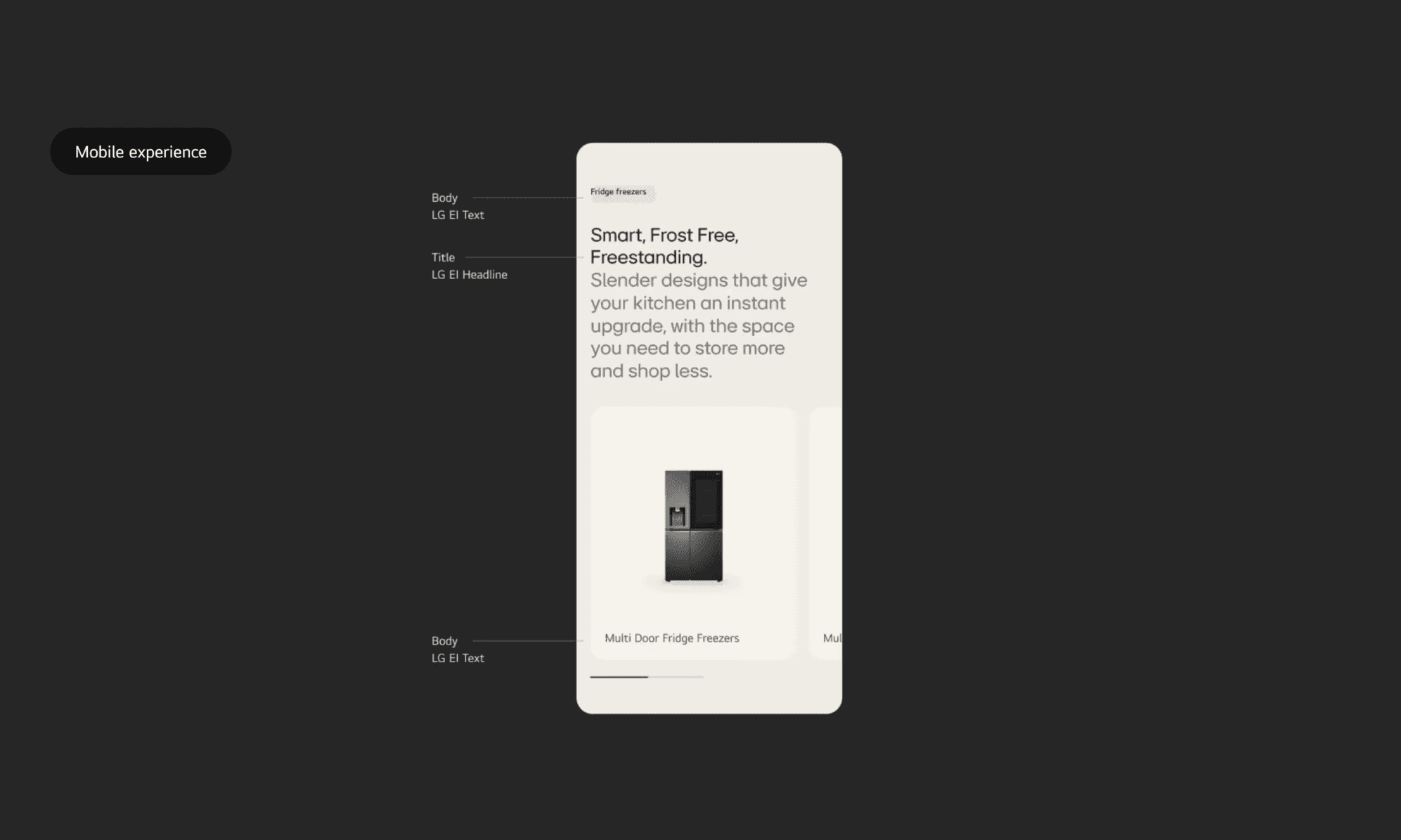


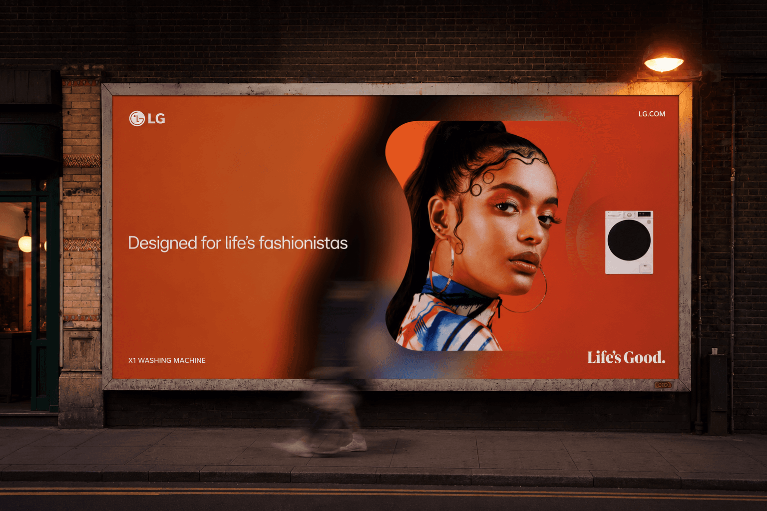
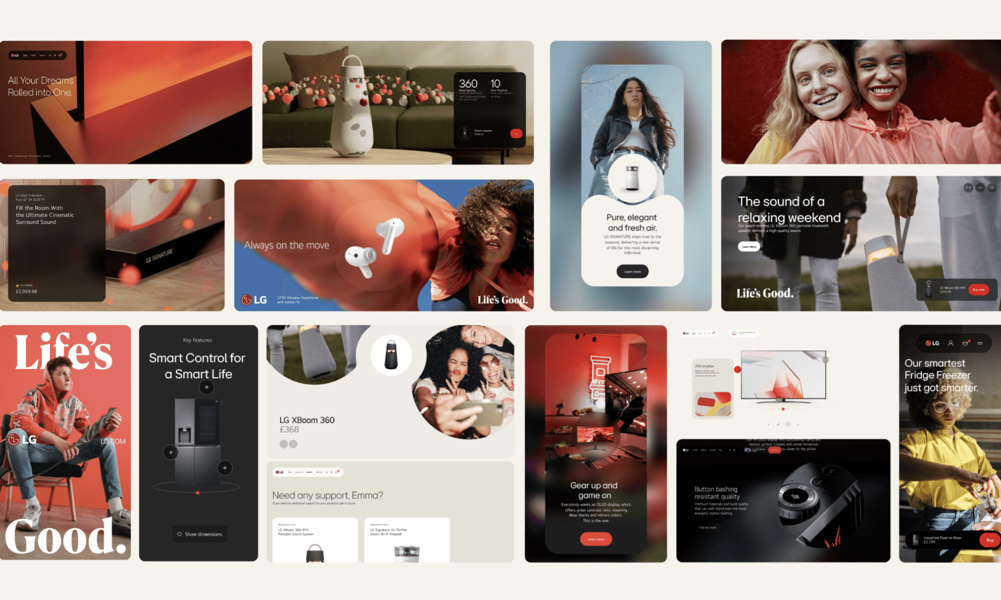
An integrated brand campaign that brings LG’s “Life is Good” message to life across digital platforms and physical experiences—bridging innovation, emotion, and everyday life.




I’ll walk you through the details during our meeting